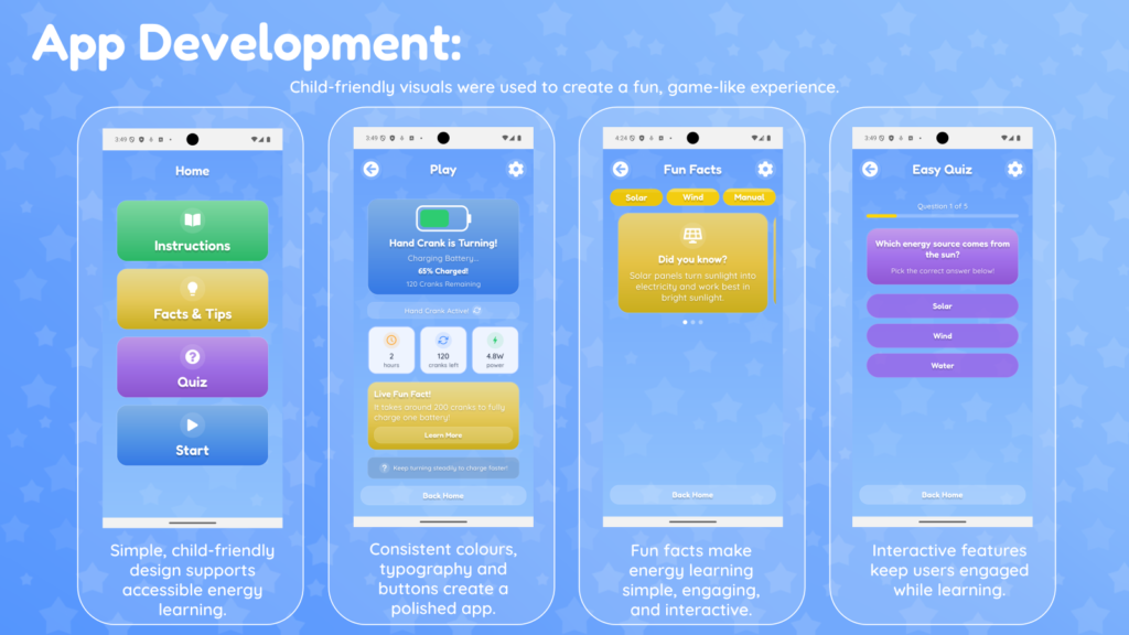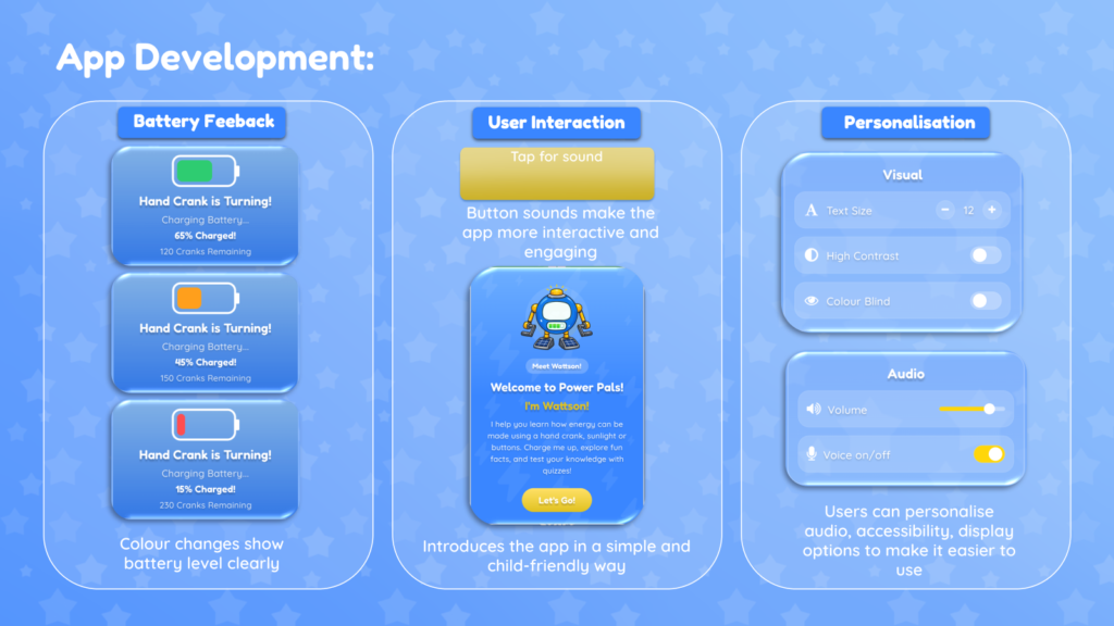
This week I implemented some of the feedback we received from user testing. One of the main changes I made was adding a welcome modal, which gives users a quick introduction to the app and explains what it is for when they first open it. This felt important because the testing showed that users, especially children, need clear guidance straight away so they understand the purpose of the app before exploring it independently.

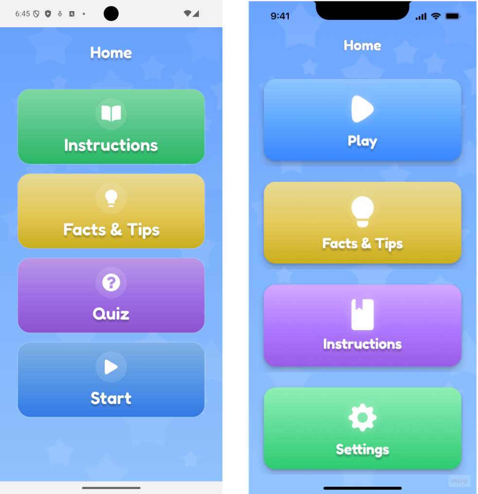
I also made the header icon buttons larger, so they are easier to see and press. This was a useful reminder that small design details can have a big impact on usability, particularly when designing for children. I rearranged the Home page buttons, so the app flow made more sense, and I replaced the main Settings button with a Quiz button. After testing, this change made a lot of sense because the quiz is a more engaging feature for children and fits better with the main learning experience of the app.
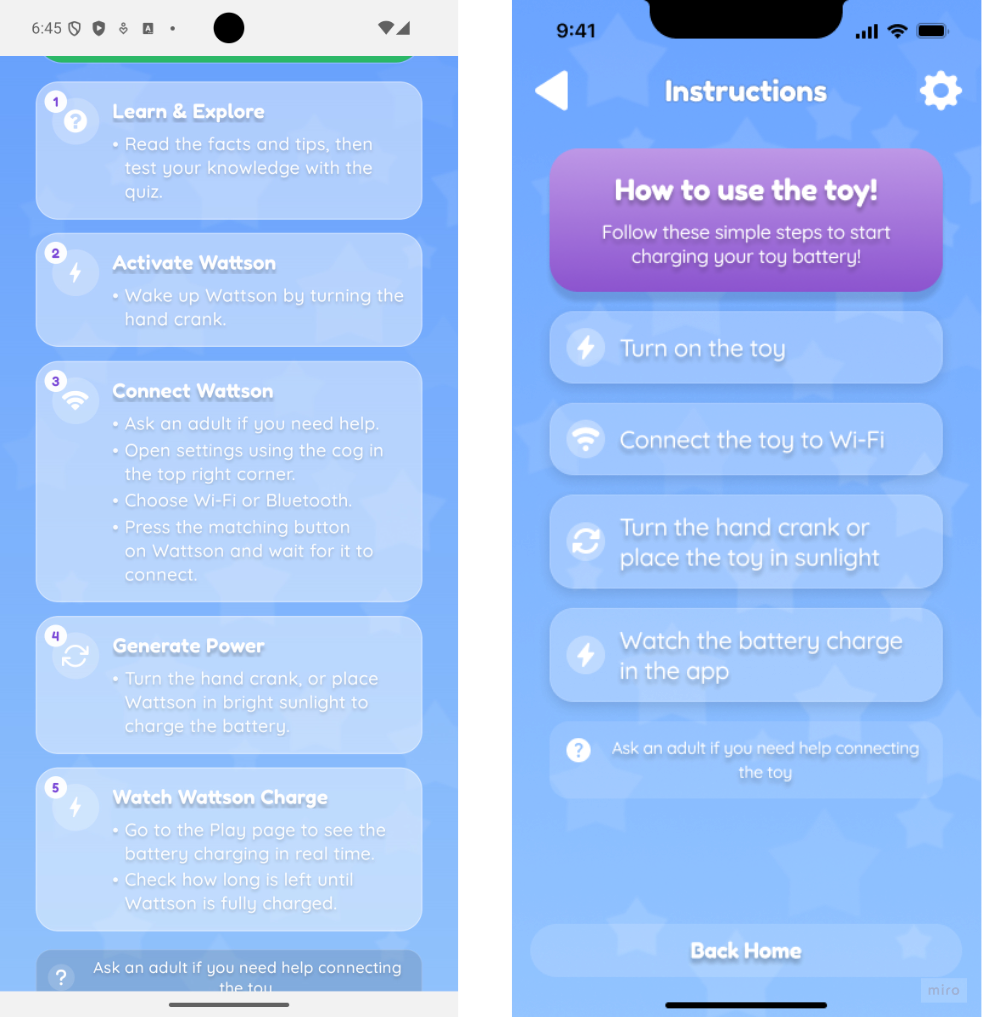
Another improvement I made was to the Instructions page. I broke the original steps down into smaller, more manageable tasks so that children could follow them more independently. This helped me understand the importance of designing instructions around the user’s needs, rather than assuming they will understand the process in the same way I do as the developer.
The testing session was very insightful because it allowed me to hear what the children thought about the app and understand their thought process while using it. Their feedback helped me see which parts of the app clear and which areas were needed improving. It also gave me useful ideas for future developments, which made it easier to complete the future development slide for the presentation.
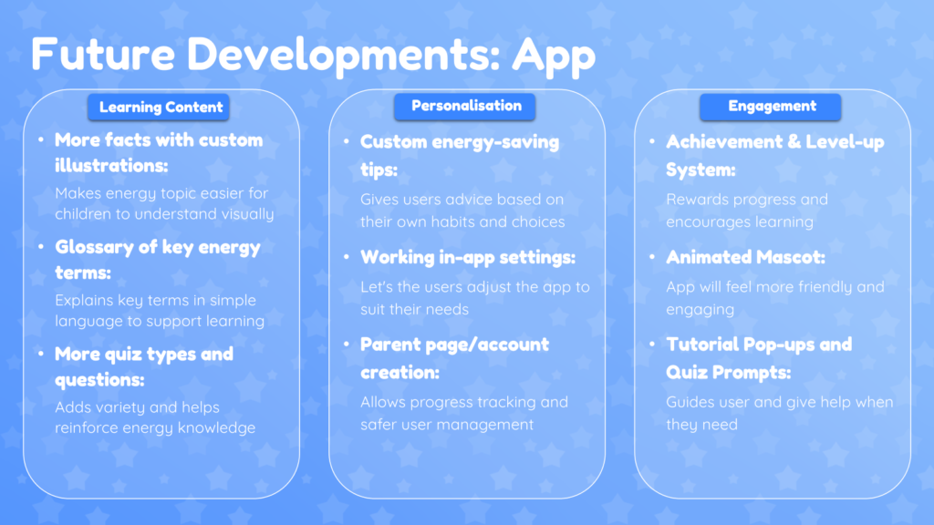
I also refined the app development slides in the presentation after receiving feedback from Diana. I tried to make the slides feel more like a pitch by reducing the amount of text and focusing more on the key features, visuals and reasons behind the design choices. This helped me think more carefully about how to communicate the project to an audience, rather than just explaining everything I had done. Overall, this week helped me understand how valuable testing and feedback are in the design process. It showed me that even small changes, such as button order, button size and clearer instructions, can make the app easier and more enjoyable to use. I also feel that I am becoming better at responding to feedback, improving my work based on user needs, and presenting the project in a clearer and more professional way.